
Everyone Onboard is a startup company which created a platform that connects employees within the company to sets up networking opportunities between employees of different departments.
Everyone Onboard already has a design for a platform, but the founders wanted to improve UI and UX side of the design and to run further explorations. John Gore, the founder, reached out to Designation, and my team of three was assigned to this project.
After the research our UX team realized that employees working for organizations with multiple departments need a way to take ownership over their workday, so they can find the time to form new, personal connections through Everyone Onboard. Therefore they focused on how to make the Everyone Onboard platform an effortless and a quick tool and redesigned the existing solution.

Team Work
UX team handed off their wireframes and the research they conducted for Everyone Onboard to my team. We examined their research and conducted our own to better prepare for a kick-off meeting with the client. We discovered that Everyone Onboard is a platform that uses an algorithm to connects employees within the company. The employees receive all notifications about meetups through the emails. The only interaction they can make with Everyone Onboard Platform is if they want to edit their profile info and to see a list of people they had met, or to find a profile of the person they are set to see for a future meet up. Since the users visit this website rarely, our task was to create a memorable and pleasant user experience.


We conducted a kickoff meeting to present the project scope and to learn the client’s opinion of the current website and his visual preferences. John described Everyone Onboard as a modern, approachable, but professional, recognizable, and genuine brand that tells the story of the human side of work. Since the audience is the typical working class with little time to waste, the primary goal of this platform was to make the user’s experience fast, effortless and interesting. He disliked implementing blue color into the brand because in his opinion it felt too corporate. A friendly and interesting feel of the brand, John wanted to convey through broad use of the illustrations and iconography, which he is a big fan of.
Visual Competitive Analysis
To learn market trends and opportunities for differentiation, our team explored direct and indirect competitors. We planned to pay close attention to intuitive onboarding process and to examine how they solved the calendar solution to create an easy and memorable experience.

Preliminary takeaways: We discovered that platforms that exist in the same competitive space as Everyone Onboard don’t have very many visual elements to their interfaces, as most of their service is executed through matching algorithms.
Further Research: We decided to broaden our research to indirect and out of category competitors to get a better understanding of how other websites convey memorable and quick onboarding process. The reason we picked these websites was the competitor's design approaches were based on illustrations and friendly colors.


Key Takeaways
Usage of white space: Generous use of negative space reduces clutter and makes the screens look sleek and modern.
Sans Serif Typography: was used to keep the design to look contemporary, to help with readability on text-heavy contents and to bring a sophisticated look and feel to the design.
Friendly colors: The use of vibrant colors to convey a friendly and inviting aesthetic and feel.
Illustrations, iconography, nonstock imagery: Iconography provides a visual reference, helping users to better understand the information. Including a nonstock photography to look more friendly and less corporate. To keep the users engaged.
After analyzing the competitors, my team decided to use bright and fun colors, combined with interesting iconography to convey friendly and inviting look. Combining a generous use of white space, sans-serif font and well-organized layout of the elements promoted clarity, simplicity, efficiency, and modern look and feel. Microinteractions were significant elements of the project since they convey a feeling of engagement.
Design Principles
The research we conducted and the information we gathered during a kick-off meeting helped us establish a strong set of design principles, and would help Everyone Onboard achieve its goals. The established Design Principles would present a reliable guide for us as we start creating our design directions.
Secure my faith in you
Being a third party company, the platform needs to gain the user’s trust through professional relevance. By implementing familiar and consistent design patterns, the branding should look honest and authentic.
Give me a helping hand
Professionals are often preoccupied with work and need to stay productive. The platform is an efficient and effortless tool that gets the job done without the fuss. To convey this design principle, we decided to use organized element layout and make sure our design was not burdened
with nonessentials.
Make me feel like I belong
Everyone Onboard seeks to build a positive company culture - helping colleagues feel that they belong in their work community by fostering
new relationships. We decided to achieve this principle by implementing a friendly and non generic language, so the users sense friendly and
home-like vibe.
Be a delightful part of my life
The visual design should stand out through the use of captivating colors and fun micro-interactions so that it brings joy to the user and leaves the user with an unforgettable and positive impression.
Style Tiles
Focused on the design principles, the feedback we received from the kickoff meeting, and user’s needs, I started creating three divergent design directions. These three concepts served as a tool for exploring John’s visual preferences at the upcoming meeting. My goal was to design extremely divergent styles to give John a wider variety, on the other hand it was a challenge for me to convey the same feel and voice using utterly different design styles. Creating these styles, I looked at the Everyone Onboard current design and tried to solve the issues everyone onboard had.


Our team was looking forward to meeting John at our Sprint 1 meeting to share our design research and design principles we created, and to get feedback on design directions we created for Everyone Onboard. John appreciated the visual approach of second and third style tile, but his favorite style was Style 1. He was in favor of curves and rounded shapes of the CTA buttons in combination with the earthy color scheme, in his opinion it conveyed organic and humanizing feel. Round shapes and earthly colors weren't something he imagined for Everyone Onboard brand but was curious to see a further exploration of this style. This feedback was to be very valuable to me and encouraged me to develop the key screens for desirability testing in the next sprint.
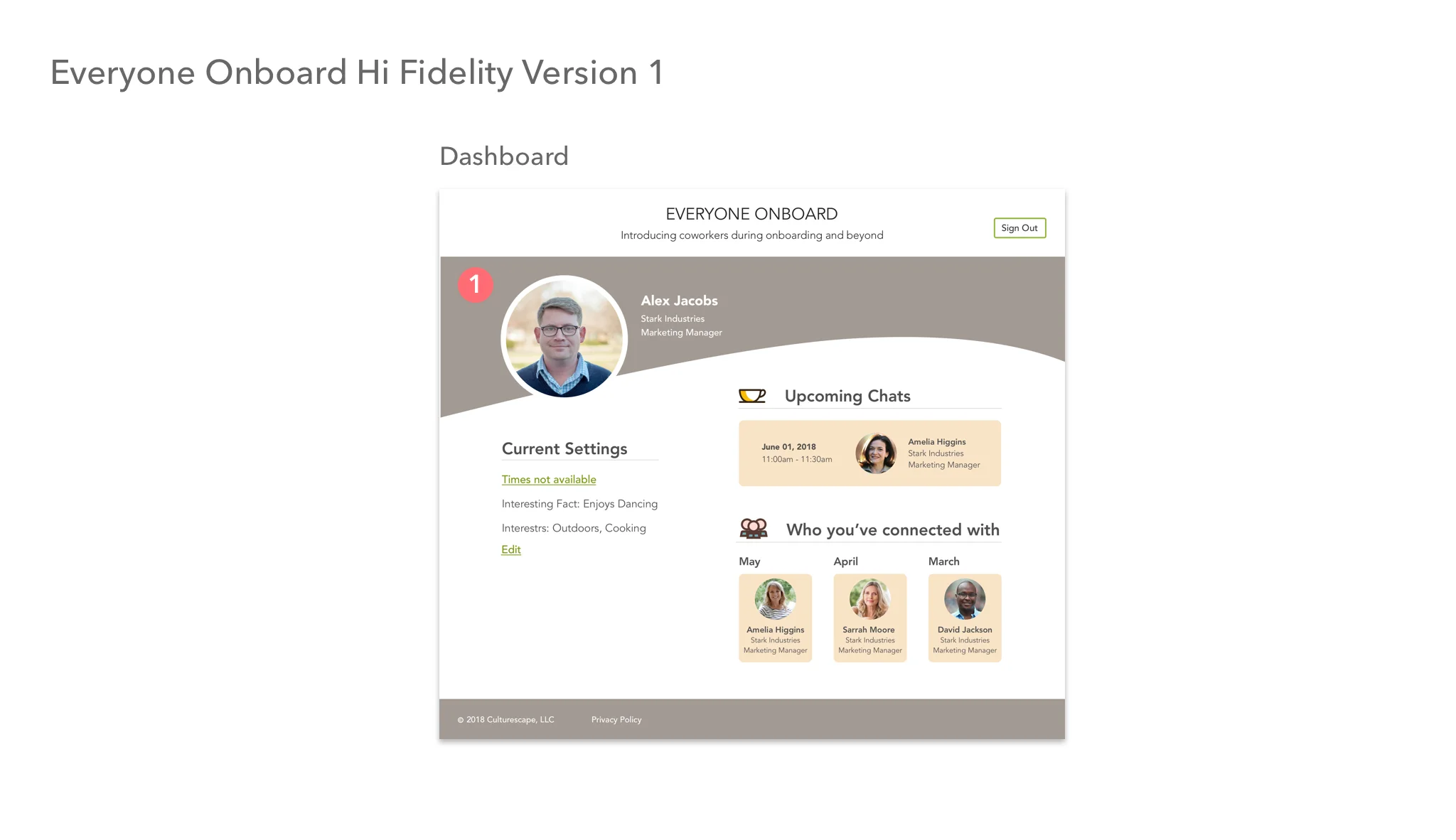
Hi Fidelity Mockup
Based on the feedback received and design principles we determined for Everyone Onboard brand I started concepting key screens for desirability testing in the next sprint. I implemented elements from my first style tile to high fidelity mockup to create a design that stayed true to our design principles. Beige and brown tones combined with curvy section dividers and colorful iconography and illustration conveyed approachable, friendly and homelike feel. Generous use of white space and thin sans serif font conveyed clarity and professionalism. For an effortless customer experience, we organized design elements by sections and symmetrically laid out.


Testing
The goals of this round of testing are to gauge users responses to the visual, organizational and emotional impact of my design solution for Everyone Onboard. Our team desirability tested our concepts with four users. All of them worked in mid-size companies and were not familiar with Everyone Onboard platform and had never used this concept of matching platforms before. These group of testers matched our target audience, and I was confident that would result in relevant feedback that would be valuable for our future steps. This round of testing was a great opportunity to see if our designs convey the design principles we tried to implement into them.
Feedback
Users liked the color scheme and organization of the elements; they thought my design looked clean, professional, reliable, friendly and inviting. Iconography and Illustrations added a playful feel. They were in favor of 1. real people photography for profile sections vs. avatars that were introduced in other concepts. One of the testers said “it’s mindless,” meaning being effortless.

Users also pointed out areas for improvement. They wished 1. the font is more prominent and 2. numbers listed steps as they had seen it at one
of the other designs. Additionally, 3. they suggested removing weekends from the calendar since the meetups were not meant to be held on
these days.
After testing, we presented our design to John to get his opinion on our solutions. He was pleased to see the diverse designs our team came up with; it helped him familiarize himself with a broader range of concepts. John liked the curves I introduced into the design, he thought they differentiated the design from the competitors. Compelling Illustrations successfully visually described the content. Additionally, he appreciated a balance conveyed between professional and friendly feel I expressed in my work.
Iterations
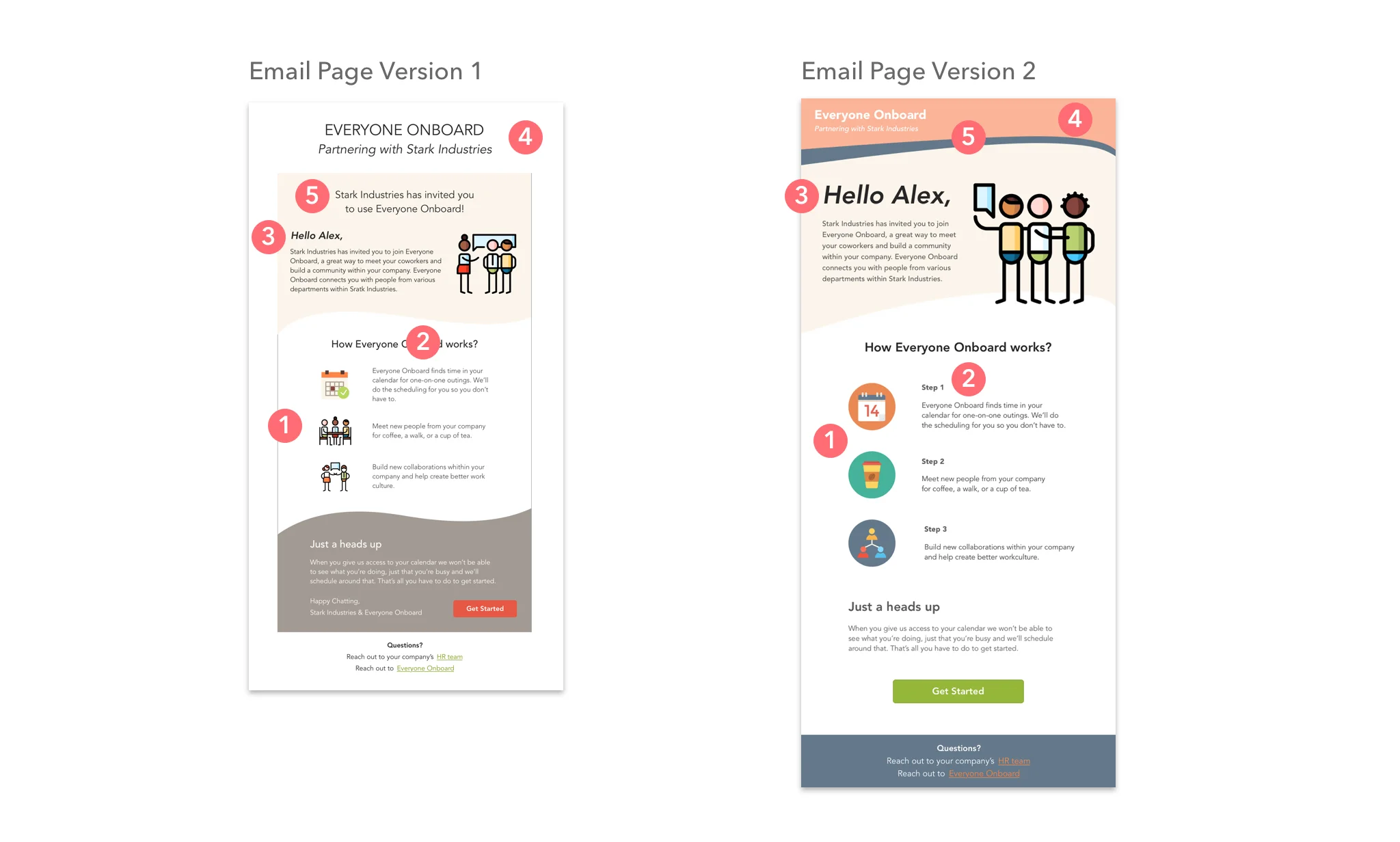
The feedback my teammates and I received for our concepts, I used as a guide to improve my design. To make the design more intuitive, I replaced the 1. illustrations that showed the steps on the email page with vibrant iconography and 2. added numbers to list them for better user experience. 3. Increasing the size of the font and 4. introducing more colors to contrast beige tones, would make the design more motivating. Additionally, 5. I decided to remove a prominent banner from the email page that talks about Stark Industries and Everyone Onboard and Increase the size of the user’s name to make the design more personal and to prioritize the users.
Usability testing
For this round of testing, we had five testers, four of them worked in large companies, and were not familiar with Everyone Onboard or similar platforms. Since most of our testers were our target audience, we felt we would get valuable insights that would help us improve our designs. The goals of this round of testing were to gauge the functionality of the iterations of the prototype to discover issues within the design and to understand what features resonate with/frustrate users.
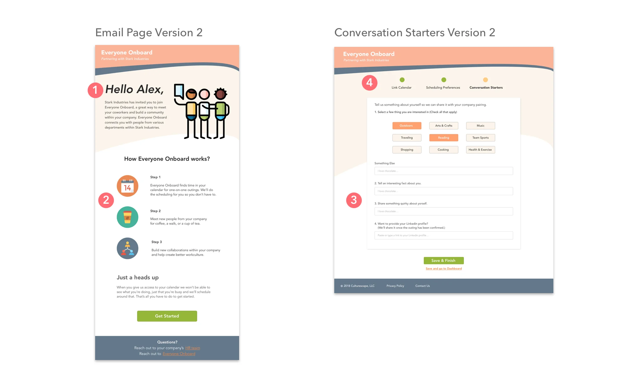
The testers appreciated the changes I made on the email page. 1. They were pleased to see their prominent name at the top of the page accompanied by a personal message and a friendly illustration. The onboarding process was very intuitive and straightforward. 2. The Implemented colors combined with vibrant and intuitive iconography felt more motivating and friendly. 3. The users liked having form fields pre-populated at the Conversation Starters page, they said it helped them make faster decisions. The product reactivity test results for my design were: friendly, personal, clean, motivating and straightforward; which matched Everyone Onboard Design Principles I had been trying to convey. This round of testing gave me valuable feedback for areas for improvement. 4. For better navigation, the users suggested the progress bar to be more prominent.
Even though I received positive feedback from test participants, I felt that there was still room for improvement in my design. I'd introduced an orange color to the header sections in order to make the design more colorful and to add interest for users, but I felt this ended up causing the header sections to overwhelm other areas of the design. For this reason, I decided to replace the orange with white in the header sections, since it is a neutral color that conveys professionalism and gives my design a straightforward quality that remains friendly and inviting. I presented my thoughts to John, he trusted my opinion and encouraged me to continue with the next steps.
Hi Fidelity Mockup Final
I implemented the feedback I received for my work as well the feedback my teammates received for their concepts as a guide for future iterations and was looking forward to presenting it to our client.
While creating my final design, my primarily goal was to convey all the design principles we determained for EO brand and at the same time to be visually atractive. I excluded orange color from the header, because it felt overwhelming and felt I was going away from the design principles. I wanted my design to look friendly and motivating but primarly to look profesional and straightforward.


Final Prototype
After finalizing hi-fidelity screens, I created a prototype for Everyone Onboard to demonstrate the full user experience.
Final Deliverables - Style Guide
To establish brand guidelines, I created a style guide that would help designers and developers understand Everyone Onboard’s brand tone
and voice.
Future Considerations
The scope of our project did not give us time to revisit branding solution for Everyone Onboard. John wanted to change the current state of the
brand and was open to new ideas. With more time in the next phase we would recommend that logo and palette are updated to better represent
the brand.
Our priority during the 3-week sprint was to focus on the usability and aesthetic of the project. If we had more time, we would add micro interactions to the design to make it more engaging to the users.
During testings and creating hi-fidelity mockups, we learned that calendar page could be improved. The testers had concerns about calendar and scheduling time privacy. They worried about privacy if they linked the Everyone Onboard Calendar with their Google calendar. Our future consideration would be to revisit a UX part of this page and test it.
What I learned
Working on Everyone Onboard project, I learned the value of explaining my design decisions to the client. It was important to communicate reasoning for my design decisions to our client clearly so we can be on the same page. Even though we had a time constraint, we learned how significant was to take the time and dig deeper into the research to achieve the brand goals. As we worked in a fast paced environment, we learned to time frame our work and balance research time with designing. This was an excellent experience for my personal growth as a designer, as I learned how to take a proactive approach to feedback and collaborate in a team.