

Client: Javaya Role: UI Designer Tools: Sketch, Photoshop, InVision, Keynote Time frame: 3 weeks
Javaya™ is a young startup e-commerce marketplace offering a wide assortment of craft coffees by the best specialty roasters in the U.S. Coffee at its peak freshness is delivered to customers’ doors.
Currently, urban millennials prefer to buy coffee at local coffee-shops because it’s a satisfying experience–they like to support small businesses and feel personally connected to the staff. To incentivize them to buy coffee online, they need to understand the story behind the beans so that they buy coffee that they believe in, both in terms of flavor and ethics.
Our task was to visually communicate Javaya as a craft coffee e-commerce site that offers and delivers a large assortment of unique coffee brands that are mature, premium products to the customers. Prior to my involvement, a team of Designation UX designers worked on this project and made wireframes to solve some of the functionality issues of the website. Javaya targets urban millennials who like exploring different varieties of coffee.
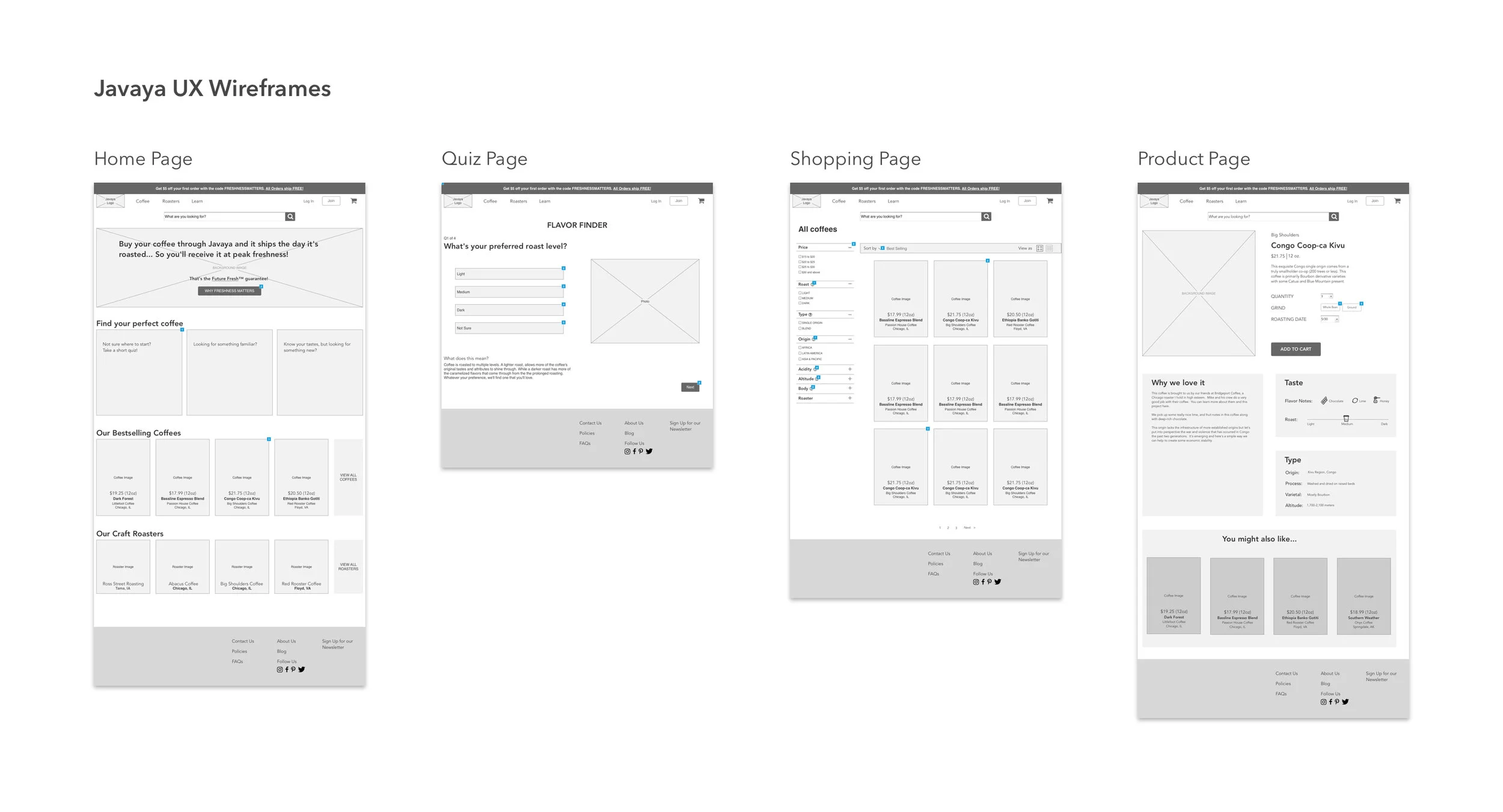
The current Javaya website was easy to navigate for existing users that knew which coffee they were looking for. On the other hand, it was not intuitive for the first time users or those who wanted to search for coffees based on the flavor they preferred. The quiz section of the Javaya website wasn’t intuitive, because it didn’t have any explanation text for the offered questions. Moreover, the results from the test were sent to the user's email address instead showing them right away after the quiz was completed. Therefore, the UX team redesigned the quiz section and created a transparent home page where the users can find a roasters, buy coffee, see promotions and take the quiz. The UX team handed off their project deliverables to my UI team to develop a recognizable and inviting brand that will stand out from Javaya’s competitors. We had a three week period to create style tiles, high fidelity mockups, and a mobile responsive marketing website.
Our initial priority was to go to the current Javaya website to explore the UX and UI side of the design to get a better understanding of current visuals and to prepare for a conversation with our client to better understand his vision for the brand.

The client disliked dark overlays and dark photography treatments. He prefered light and inviting photography treatments. Design should tell the story of coffee freshness.

Roaster section was not intuitive due to cluttered card layout and illegibility of the font. Hierarchy was confusing due to uneven card and logo sizes.
Team Work
For this project, our three person team was assigned to deliver the user interface for the Javaya brand. As a team, our task was to explore direct, indirect and out of category competitors and withdraw takeaways that would give us an insight in current trends and create guidelines for future design explorations. At the kickoff meeting Nick told us his opinion on the current Javaya website design and changes he would like to make. He wanted the Javaya brand to be less prominent so that it didn’t outshine the coffee roasters and coffee products. During our kick off meeting we performed a gut test, as well, to learn about our client’s visual preferences. We created slides of fifteen different design patterns and asked the client for his feedback. Nick, our client, prefered a minimalist approach with friendly and non-stock imagery, a lot of white space and a warm color palette. The gut test feedback we received from the kickoff meeting was very valuable to me because it gave me confidence that my vision of the design direction for Javaya aligned with what the client wanted for the brand. The scope for this project included preparing question outlines and presentations for meetings with the client.
Competitor Analysis
To learn competitor trends we conducted a visual competitive analysis to find a way for the Javaya brand to keep up with the latest trends and to differentiate itself from the competitors. Our goal was to explore how the competitors convey freshness and varieties of coffee, and what graphic elements they use to look sophisticated, friendly, and trustworthy. My team decided to explore the competitors that successfully solve the problems that the Javaya brand was struggling with.
Direct Competitors and indirect competitors


Key Takeaways:

Approachable colors: Muted color schemes are softer and easier on the eye. They convey a friendly and inviting aesthetic.

Classic and modern fonts: Combined use of serif and sans serif fonts - classic serif fonts are used to express the artisan heritage of a product while simple sans serif fonts keep the brand modern.

Visual organization: Prominent use of card layouts to show products. Cards are visually appealing and make the information easier to consume.

High quality images: High resolution photography helps to achieve a premium aesthetic for the brand.

Clean and minimal interface: Generous use of negative space reduces clutter and makes the screens look sleek and modern.

Engaging photography: Including the people behind the product makes the product feel more personable and relatable.
After analyzing our competitors, we decided to use bright and inviting photography that shows the people behind the roasters to humanize the overall look. We also decided to use photography that tells the story of a good quality coffee, plenty of white space to promote clarity and airiness, and a sans serif font to create an approachable and modern feel.
Design Principles
Our team discussed what we knew about Javaya, the users, the brand voice we wanted Javaya to convey, and the visual design elements that will help Javaya reach its goals. Based on our takeaways and the client's view of the brand, we came up with design principles that would be a foundation for our design directions and that would help Javaya reach its desired audience.

Premium quality at your fingertips
Good Coffee shouldn’t be hard to get. We are a craft coffee collective connecting you with the best roasters, so that you can purchase the finest coffees effortlessly. To convey this principle we decided to use a minimal interface, sans serif typefaces and organized card layouts to make the user experience easy.

Know the Story, Show the Story
Every bean has its own special journey. We strive to showcase the uniqueness of every bag and each roaster, so that you know exactly what you are drinking. I decided to tell the story of the coffee and to make the design visually attractive to the users by using high quality photography that shows people interacting with coffee.

Freshness You Can Taste
Coffee is best enjoyed shortly after the roast. We want you to have the best cup of joe by experiencing the enriching flavor of coffee at peak freshness. We conveyed this principle through the usage of rich, warm brown colors that represent freshly roasted coffee.
These design principles helped us visually connect the Javaya brand to its users and to establish the foundations of our designs. Once we started exploring our concepts, design principles helped in ensuring we stay consistent with the fondations we determined.
Style Tiles
After we conducted research for Javaya project, the team began work on individual concepts. Even though I like working in a team, designing is my favorite part of the process. I can spend hours designing and searching for new ideas.
Based on the design principles, and the feedback we received from the kick off meeting, I started creating three divergent design directions that would achieve the artisan, approachable, and trustworthy look and feel while also clearly sending a message of freshness. Furthermore, my goal was for Javaya’s design to be recognizable and stand out from its competitors.


At our Sprint 1 meeting with the client, I received valuable feedback from the client on my style tiles that helped me choose a design direction that would best represent the Javaya brand. His favorite was the minimalistic style tile. He liked the bright treatment of photography, broad use of white space, and gold color in combination with dark blue. He disliked the serif font, in his opinion it appeared too mature. I was very excited about this project because I was in agreement with the client that the minimalistic design direction would best fit the Javaya brand.
Wireframes evaluation
I reviewed the wireframes from the UX team in order to gain a better understanding of the product. There were several things I wanted to change to increase the usability of the product; therefore, I redesigned some of the screens and looked forward to testing it.
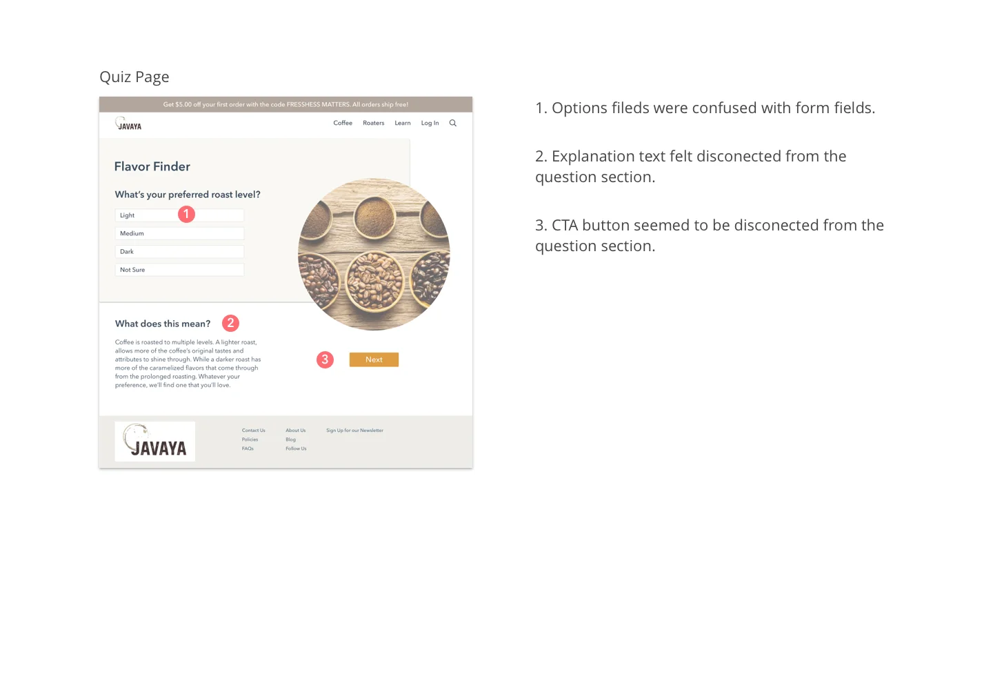
Quiz results screen

1. I added more coffee options for each flavor on the Flavor Finder Results screen. In my opinion, coffee connoisseurs would like to have a bigger variety of coffee to choose from.
2. For better navigation, I divided all flavor sections into columns and placed the variety coffee cards into a carousel.
3. Additionally, I excluded “Flavor Finder Results” topic and replaced with, “We think you will like these…” because it sounded more friendly and casual.
Product screen

1. To keep the design clean and less cluttered, I removed the search bar from the top of the page and replaced it with a simple search icon that I placed on the top right corner of the navigation bar.
2. The UX wireframe had a Log In button and Join button incorporated into the navigation bar. Having these two buttons next to each other appeared overwhelming to me, so I consulted the UX team about the reasoning behind this decision and asked if I could exclude one of the options. The UX team said that they included a join option because they saw some other websites using these, but they also thought that having these two options might be confusing to future users. Therefore, I excluded a Join button to simplify the user experience.
3. Having the customer review section built trust with the user and allowed them to more quickly make buying decisions.
This experience was helpful to me to practice UX part of the design and to improve in designing user friendly and visually appealing designs. Changes I made to the original wireframes improved functionality of the product that was confirmed during user testing. These changes made Javaya brand trustworthy and more intuitive. Moreover, they helped users to trust the product and to make quicker purchasing decisions.
Hi-fidelity mockups
To create high-fidelity mockups, I combined elements from all three style tiles, with a primary influence from the first style. I made sure that Javaya design principles were introduced into my design. Light neutral beige and brown tones with plenty of white space were used to create an image of the freshness of the coffee. Bold orange accents were used for the CTA buttons and links to give a pop of color achieving a more friendly and approachable vibe. Also, as a representation of the coffee’s origin, real life photography of roasters interacting with the coffee were included. For an easy and memorable customer experience I made sure that the layout of the pages was well organized and easy for navigation. I used a combination of circular and rectangular shapes to create the design more interesting and friendly for the user.

My team tested our concepts for desirability with three testers. Of those three, two were returning users and one of them was a first time user who was a coffee connoisseur. Testers liked the look and feel of my design. They thought the content was well organized, liked the bright and homey photography that speaks of the Javaya brand, and liked the color palette because it speaks of freshness and is motivating. They wished the hero image and the welcome card on the Home screen were smaller for easier digestion of the content.
Feedback


After testing we presented our design to the client and he was satisfied with my design solutions, but he disliked having flavor images on the coffee card. He wanted the coffee bag to stand out and didn't want any other elements around it to distract the user from the coffee. The background image in the taste section of the screen was, in his opinion, too much; he preferred a clean and simple look. At this point, I had a clear view of the next steps. The client’s guidance was very helpful in making design decisions and moving forward. I understood Nick’s point and decided to remove a background image and flavor images from the product card even though users liked it during testing.
Iterations
I iterated on my initial design to create and test a final design solution for this project that would be educational and user friendly. For this round of testing we had just three participants. After the testing, we felt we didn’t receive valuable answers, so we decided to conduct guerilla testing to obtain more relevant feedback. We went to Dollop Coffee and interviewed twelve people. The scope of the guerilla testing was to show testers our design solutions and to conduct product reaction activity tests. Product reaction activity test was performed where we gave the testers a list of adjectives and ask them to chose up to five that relate to the design they were shown. The main reason of the test was to make sure our designs matched our visual design principles. The adjectives most relevant to my design were: Clean, e-commerce, friendly, earthy and intuitive.


Prototype
The high fidelity screens I created were a result of the valuable feedback I received from the client, testers, our creative directors, designers in residence, and peers. I greatly appreciated the feedback, which helped me create a successful product that my client was excited about.

To bring high fidelity screens to life and to demonstrate functionality of the product, I created a clickable prototype.
Marketing website
Javaya already has a marketing website that matches their current brand. Even though Nick didn’t expect us to redesign it, my team consulted with our creative director and decided to make a mobile responsive version of their marketing website. The marketing website I created for Javaya carried over visual elements from the website version to advertise and communicate the Javaya brand and its business ethics.


My design solution for Javaya marketing website for mobile you can see here.
Style guides and UI kit
After finalizing the mobile responsive marketing page for Javaya, I created a style guide and a UI kit to establish brand guidelines for Javaya. This style guide represents the core visual elements that represent the brand and it’s intended to help designers and developers understand Javaya’s brand tone and voice. You can find these here.
Future consideration
If I could take the project further with Javaya, I would conduct further testing of the product with existing and new Javaya users. Their feedback would be valuable to help me understand my design solutions better since most of the testers we previously tested with are current users of Javaya.
I’m passionate about creating micro-interactions, and I wished I had more time to explore them in this project to make my designs more pleasing and interactive for the users.
Additionally, our client would love to do further explorations of the Javaya logo. If we had more time on this project, it would be a great opportunity to continue working on the branding and logo that would match my design solution for Javaya.
What I learned
Due to my language barrier and lack of presenting experience I was lucky to be on a team with two talented designers who helped me overcome my difficulties. I learned how to successfully frame and concept presentation decks that were a significant part of the design process.
Presenting and public speaking were not my strengths. Luckily, Rob, our project manager, was always around to give valuable advice on how to improve my presentation skills. My presentation skills improved a lot, and I received good feedback from our Creative Director on my ability to explain my work and design decisions.
Working in a fast-paced environment and being part of a team of three people with different personalities and different work ethics was challenging. I learned how to balance and resolve tense situations in order to get better productivity out of the team and reach our deadlines on time.
I am grateful for the opportunity that I had working at Designation to get more experience with interacting directly with clients and talking about design problems and solutions on a highly professional level.